Introduction to Magazine Covers
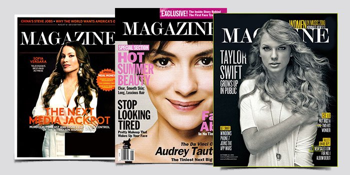
The perspective presented here is interesting as we utilize numerous magazine covers in our work as an entrance toward the ‘new world’. Whenever a person picks a magazine to go through and when he sees a magazine cover, there are so many unexplained and unvoiced emotions and dialogues that come out. Based on several factors, either a strategically placed image or some typed words, they grab the attention of the audience and have a lot of things to say without even speaking a word.But now more than ever, the cover has become more complex.
And many modernistic covers have a problem – the rise of a modernistic cover has almost drowned the nostalgic era of vintage covers. With time, the techniques of cover making have also evolved, and today’s time is all about mesmerizing and elegant presentations. Covering this aspect, it is correct to say that the way people made covers reflects the way society viewed things, art, and aesthetics. Embark with us on this adventure as we analyze the ideal balance between the world of magazines and art, which was able to be achieved on the cover and interior pages.
Table of Contents
The Evolution of Magazine Covers: From Early Days to Present
Generations have passed but this question keeps coming back. When did it start, and how did it turn into this? The first question that comes to mind is, what did it make it look like? The energy and the feeling behind it are far from simple. That simplicity was far gone. In the previous iterations of covers, they had extensive and detailed painting as they purely relied on illustrations to draw in the reader’s eye.
Technological advancements led to new ways of designing. The impetus of the advancement was the introduction of photography which completely transformed the manufacturing of magazine covers in the late 19th Century. Now real faces and unposed photographs could tell whatever stories and emotions that an illustration could.
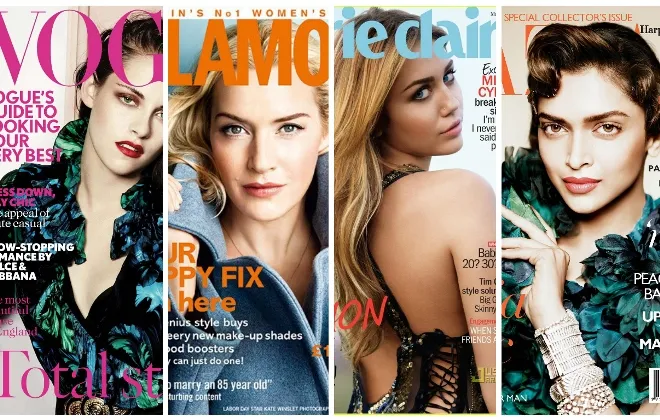
In the mid-20th century, Life and Vogue magazines started to reach extraordinary dimensions in creative development, implementing advanced typography and experiments with colors in their layout design. They were able to employ powerful color combinations and layouts that successfully characterized a period.
Magazine covers today combine both art and advertising. The possibilities of modern technology contribute to the complex designs, interactivity, and even AR of covers. These days, most people are bombarded with so many things to the point that they can only stay focused on something for a few seconds which makes it critical for the cover to grab people’s attention while being able to tell a story at a split second.
Elements of a Striking Magazine Cover

A stunning magazine cover will catch your eye within seconds. Almost everything that a brand can use for a first impression, an image, a layout, a style applies here so the first shot has to be perfect.
Typography is one of the design’s most important traits we can utilize in our work to make it stick out. Distinctive fonts artistically show the style of the printed materials, whether it is sophisticated, eccentric or childish.
The last, but not the least, element is the imagery. A striking picture grabs attention and makes the audience want to read more. The best images elicit the appropriate feelings from the target audience.
Equally significant in establishing the tone and ambience of the subject are the color waves. Bright hues can increase energy levels, whereas soft shades can suggest elegance.
The layout unifies all the ingredients—proper proportions of text and graphics without overloading the audience’s attention. It is necessary for every element to work together so as to tell a graphic narrative that effectively attracts prospective readers at ease.
Iconic Magazine Covers That Shaped Pop Culture
It is unarguable that some magazine covers have fed into our popular culture. Look back at the iconic New York 1965 cover of Bob Dylan, a young and idealistic figure. His face said the most to a generation.
Out of it, Time magazine came out with the question “Is God Dead?” in 1966. It triggered a debate on faith versus modern times that is present even today.
More than two stars were pictured in the Rolling Stone’s ‘1970’ cover: John and Yoko; a more than adequate portrayal of the two pop icons that ushered love and activism to a whole new level even back then.
Vogue’s famous September issue of 1988 raised the issues of racism in fashion, photographs of Naomi Campbell came out long before the discussion was anything intimate.
As well as pushing their sales, these covers were more active in trying to keep the people engaged in movements and a discourse. All these functioned as a reminder of the bioscope and serve as a testament to the times. Each one, because of its peculiar imagery and compelling messages, became ingrained in the Zeitgeist.
Behind the Scenes: The Creative Process of Designing a Magazine Cover
Creating the magazine’s cover is an art form in itself. It starts with the ideas of that particular era when there were no restrictions. The editor, apart from the designers and the photographers, all work on the theme of the given issue together.
The importance of Research cannot be overemphasized in these parts. They study what the market offers, what kind of audience exists, and what visual solutions work. Each element should complement both the storyline and the brand.
When the core ideas have been worked out, it is time for sketches. These sketchy veins are inspiring and allow proceeding from rough ideas to their graphic design versions. Tints and types are also used on them.
Feedback rounds guarantee that all the issues are addressed, whether it is page layout or a photograph. This stage of the stage is not very swift however is important in getting things right.
When the time comes for approval, that is when the cover is encrusted in the figurative flourishes- making sure it draws in the audience at first sight!
The Impact of Social Media on Magazine Covers
The introduction of social media has altered the traditional use and practice of magazine covers in a drastic way. Websites such as Instagram and Pinterest complicated their roles into a promotion and a pitch for a visual product. They give designers an opportunity to show their work and receive a reaction before the actual publication.
The magazines focus on such niches as millions of users search every day, and therefore it is necessary to sustain interest quickly. The use of rich colors, interesting fonts, and concepts is an absolute must. Every single Instagram account can either be a success or remain unknown due to harsh rivalry.
In addition, social media trends follow in a very fast manner. What works for the audiences today may not be of interest tomorrow. Magazines are in a perpetual cycle of reinventing themselves to keep up with the changes in such a dynamic landscape.
Employments of influencer marketing further push boundaries in conventional marketing approaches. The sponsors of these collaborations often determine the cover options which creates a mixture of advertising and editing features and enables advertising among many diverse audiences.
The Future of Magazine Covers in the Digital Age
With the advancement of technology, the transformation of magazine covers has become even more interesting. Due to the advent of the digital medium, there is now space for movement which is impossible in a printed medium. Now such covers that have animation and interactivity are within reach, attracting the attention of the public like never before.
Augmented reality (AR) technology is changing how the audience interacts with the content. Perhaps a cover scan will provide access to some kind of complete videos or interviews. These technologies provide a new and a different bond between the readership and the magazine.
Social media also helps to bring in future changes to the covers. Sometimes a cover is designed to advertise itself by captivating graphics for the benefit of the busy feeds.
What’s more, environmentally friendly designs are becoming the norm. With environmentally friendly materials becoming prevalent among buyers, it is expected that both the print version and the E-edition version will have ecologically friendly materials.
Knowing that these are the innovations that are in the world of magazines and sure no doubt in the future also, coverpages will also evolve but that still serves the same purpose, the primary purpose which enchants readers through strong images and graphics.
Conclusion
As culture and society representatives, magazine covers are about imagination. They mirror various transitions of the cultural and temporal dominant norms. Such changes influenced evolving design solutions.
The role played by magazine covers in the development of popular culture is enormous, perhaps too enormous. They create a whole imagery of an era, a style, and incite discussions that are far wider than the scope of the books. The creative process of preparing such designs is very elaborate and interesting and requires writers, photographers, designers, and editors to work together.
As we advance through time, there has been a constant shift in how the audience perceives content and social as one of the major faces which deliver that. As we continue to move forward with the times, so have the magazine covers. Compelling images have now become of utmost importance as marketing brands vie for viewers in the over-saturated world.
When one looks towards the future of the magazine cover while keeping the context of the digital era, there is so much room for growth. New technologies have introduced new ways of immersing and captivating oneself that are not exclusive to books only.
Every piece focuses on different aspects and each of them can be analyzed in depth. Understanding this art form is crucial not just for appreciating history, but also for predicting what will be the next step in visual narratives.


 Lit AI Inc Magazine: Transforming the Future with Artificial Intelligence
  Top 5 fashion magazines in the US